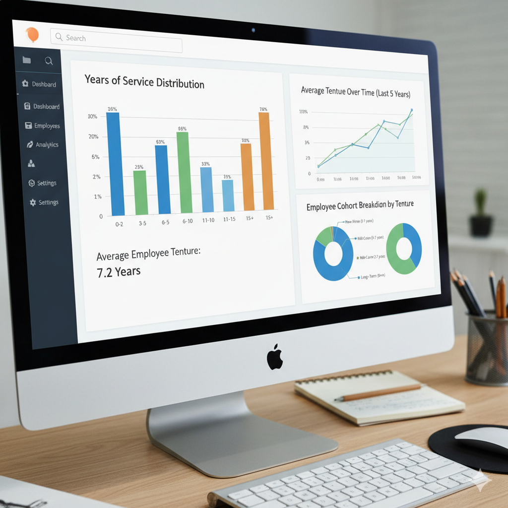
Employee tenure — or years of service — is more than just a number. It reflects loyalty, experience, and organizational health. Companies that understand their workforce’s tenure distribution can make smarter decisions about training, promotions, and retention strategies.
With the help of HRIS analytic graphs, HR teams can now visualize tenure data in real time. These visual tools transform raw employee records into actionable insights, helping organizations celebrate loyalty, predict turnover risks, and plan future workforce needs more effectively.
Why Tracking Employee Tenure Matters
Employee tenure provides valuable insight into an organization’s stability and employee engagement. Tracking years of service helps HR professionals:
👥 Understand workforce composition — see how many employees fall into short-, mid-, or long-tenure brackets.
🔁 Predict turnover trends — shorter tenures may indicate retention challenges.
📈 Plan succession and development — identify experienced employees ready for leadership roles.
💰 Optimize costs — long-tenured employees often reduce hiring and training expenses.
🎉 Celebrate milestones — use data to acknowledge service anniversaries and boost morale.
Monitoring tenure trends ensures that HR strategies are data-backed, not just intuitive.
How HRIS Analytic Graphs Visualize Years of Service
An HRIS (Human Resource Information System) consolidates employee data — including start dates, job changes, and status updates — into one secure platform. When combined with analytic graphs, it provides a visual breakdown of your workforce’s tenure distribution.
Here’s how:
- Data Collection and Integration
The HRIS automatically pulls each employee’s start date and calculates their current tenure (in months or years). This data updates in real time as employees reach new milestones. - Visual Tenure Distribution
Analytic graphs (like bar or pie charts) show how many employees fall into each tenure category — for example:
* 0–1 year: New hires
* 2–5 years: Established contributors
* 6–10 years: Experienced professionals
* 10+ years: Long-term veterans
This visualization helps HR understand workforce maturity at a glance. - Department and Role Analysis
HRIS dashboards can break down tenure data by department, location, or job level, revealing patterns such as high turnover in certain roles or long retention in others. - Trend Tracking Over Time
Line graphs can display how average employee tenure evolves over months or years, helping HR monitor improvement or detect issues in retention strategies. - Strategic Reporting
By exporting these analytic visuals, HR leaders can share data-driven insights with management — supporting decisions on promotions, training investments, and succession planning.
Types of Analytic Graphs for Employee Tenure
| Graph Type | Purpose |
| Bar Chart | Compare tenure distribution across departments or teams. |
| Pie Chart | Show the proportion of employees within different tenure brackets. |
| Line Graph | Track average tenure growth or turnover trends over time. |
| Stacked Column Chart | Visualize combined data, such as tenure by job role or location. |
| Heat Map | Highlight areas or departments with high or low tenure averages. |
These visuals make it easier for HR leaders to turn complex tenure data into clear, meaningful stories about the organization’s workforce.
Benefits of Tracking Years of Service Through HRIS Analytic Graphs
- ✅ Improved Retention Strategy
Identify departments with low average tenure and target retention initiatives accordingly. - ✅ Better Succession Planning
Recognize experienced employees who are ready for leadership or mentoring roles. - ✅ Increased Engagement and Recognition
Celebrate work anniversaries and loyalty milestones with accurate tenure data. - ✅ Enhanced Workforce Forecasting
Anticipate upcoming retirements or potential turnover based on tenure distribution. - ✅ Data-Driven HR Decision Making
Move beyond spreadsheets — use real-time visuals to support strategic workforce discussions.
Implementing Tenure Analytics in Your HRIS
To get the most value from tenure tracking, HR teams should:
- Ensure Accurate Data Entry:
Maintain up-to-date employee records, including hire and rehire dates. - Define Tenure Categories:
Customize ranges (e.g., 0–2 years, 3–5 years, etc.) to fit organizational structure. - Automate Dashboard Updates:
Schedule regular system updates to reflect the latest tenure data. - Combine with Other Metrics:
Correlate tenure with performance, engagement, or turnover rates for deeper insight. - Share Insights Organization-Wide:
Use graphs in HR reports or executive meetings to highlight workforce stability.
Turning Tenure Data into HR Strategy
Tenure analytics isn’t just about numbers — it’s about understanding people.
By visualizing employee years of service, HR leaders can:
- Strengthen retention strategies through data-based interventions.
- Build career development pathways for mid-tenure employees.
- Identify high-performing long-tenured staff for mentorship programs.
- Create a culture that values experience and growth.
When HR data is transformed into visual, actionable insights, employee retention becomes a strategic advantage — not just a goal.
Conclusion
Tracking employee tenure with HRIS analytic graphs helps organizations gain a deeper understanding of their workforce dynamics. It reveals who’s staying, who’s leaving, and how tenure impacts overall productivity and culture.
By visualizing years of service data, HR teams can develop smarter retention programs, enhance workforce planning, and celebrate the loyalty that drives organizational success.
In today’s data-driven workplace, tenure analytics isn’t just useful — it’s essential for building a sustainable, engaged, and future-ready workforce.

